Graphic design is not just for professionals—it’s a skill that anyone can learn to enhance the look and feel of their projects. Whether you’re creating social media posts, marketing materials, or even school presentations, understanding the basics of graphics design can help you communicate your message more effectively.
In this post, we share 25 actionable tips that explain what graphic designers do and guide you through the process of producing good graphic design, even if you’re new to the field.
Every tip in this guide is designed to be simple, practical, and engaging. We break down complex concepts into clear, manageable steps and include real-world examples and bullet-point summaries to help you implement each idea quickly. For more insights on design strategy and branding, visit the MOVA Consulting website.
Below, each section has been expanded with extra detail, examples, and context so that you can deepen your understanding of essential design principles and techniques.
1. Understand the Basics of Graphic Design
Graphic design is built on fundamental principles such as balance, contrast, alignment, and hierarchy. Before you dive into your next project, take time to learn these basics. Start by exploring why certain elements—like color and typography—work together harmoniously and how they affect the viewer’s perception.
Understanding what graphic designers do can demystify the design process. They plan, create, and deliver visual content that communicates messages clearly. As a beginner, consider these aspects:
- Learn about color theory: Understand how different hues evoke emotions and complement each other.
- Familiarize yourself with layout principles: Study how grids, margins, and spacing contribute to an organized look.
- Explore examples of effective designs: Analyze designs you admire and break down what makes them work.
Consider taking online courses or reading articles that explain design basics. As you study, practice by sketching out layouts or recreating simple designs. This active learning process builds confidence.
Additionally, you might experiment with basic software tools to get a feel for digital design. Remember, every designer started with the basics—your journey is about gradually building up your skills and knowledge.
Don’t rush the learning process; spend time exploring each design principle until you understand how they interact. Over time, these fundamentals will become second nature, helping you make informed design decisions without second-guessing every choice.
2. Keep It Simple
Simplicity is at the heart of great design. A cluttered layout can overwhelm viewers and dilute your message. Instead, aim for simplicity by using clean lines, minimal color palettes, and clear typography.
When you keep your design simple, you allow your key message to stand out. Avoid overloading your design with too many images, fonts, or colors. For example, if you’re designing a flyer, choose one main image and a couple of supporting visuals rather than a busy collage.
Some practical steps include:
- Limit the number of fonts to one or two.
- Stick with a restrained color palette that enhances readability.
- Use ample white space to separate elements and avoid visual clutter.
A simple design not only makes your work look more professional but also ensures that your audience can quickly understand the information presented. Think of simplicity as a design strategy: by removing unnecessary elements, you make it easier for your viewers to focus on what truly matters. Experiment with minimalist layouts and see how they improve the overall clarity of your project.
In your journey as a non-designer, remember that simplicity is a powerful tool. It can transform a busy canvas into a clean, elegant work of art that communicates with clarity and impact.
3. Use a Consistent Color Palette
Color is one of the most powerful tools in graphic design. A consistent color palette not only reinforces your visual identity but also evokes specific moods and emotions. Start by choosing 3–5 colors that represent your project or brand. Use these colors consistently across all design elements.
Consistency in color creates a unified look. Whether you’re designing a website, social media graphics, or printed materials, having a consistent palette ensures that your work feels cohesive. Experiment with different combinations until you find the one that best represents your message.
Key actions include:
- Identify your primary, secondary, and accent colors.
- Document the hex, RGB, and CMYK codes so that your colors remain consistent across digital and print formats.
- Test your color palette on various backgrounds and mediums.
By understanding color theory, you’ll learn how to pair complementary and analogous colors, which helps in creating dynamic yet balanced designs. Remember, colors can also have cultural or emotional connotations, so choose shades that align with the message you wish to convey.
As you develop your palette, consider creating mood boards or swatches that capture the essence of your design style. Experiment with gradients, shadows, and overlays sparingly to add depth without sacrificing uniformity.
A consistent color palette is a cornerstone of professional design and is especially important for building brand recognition. Once you’ve selected your colors, stick to them religiously in every project to build a strong, recognizable visual identity.
4. Choose the Right Fonts
Typography plays a crucial role in conveying your message. The right fonts can enhance the mood of your design, improve readability, and reinforce your overall aesthetic. Start by selecting one or two fonts that align with your project’s tone—one for headlines and one for body text. Avoid using too many different fonts, which can create visual chaos.
When choosing fonts, consider the following:
- Readability: Your audience should easily read and understand the text.
- Tone: Serif fonts may give a classic feel, while sans-serif fonts often feel modern and clean.
- Hierarchy: Use larger, bolder fonts for headlines and smaller sizes for body text.
Experiment with font pairings to see which combinations work best together. Also, pay attention to spacing and alignment, as these factors can dramatically affect legibility and the overall flow of your design.
For example, increasing line spacing can make paragraphs easier to read, while proper letter spacing ensures that each word stands out clearly.
Keep in mind that typography is not just about aesthetics—it’s also about reinforcing your brand’s personality. The fonts you choose should echo the values and tone of your message.
Whether you’re aiming for a playful, modern look or a more traditional, formal feel, typography is a key component in setting the stage for your design.
Spend time browsing typography blogs or tools that suggest font pairings. Practice by creating sample layouts that showcase your chosen fonts in different contexts. The more comfortable you become with typography, the more natural it will be to choose the perfect fonts for any design project.
5. Understand White Space
White space, or negative space, is the area in your design that remains empty. Often overlooked, white space is a powerful tool that helps structure a layout, improves readability, and emphasizes key elements. It creates balance and gives your design a clean, uncluttered look.
When you use white space effectively, each component of your design gets the room it needs to breathe. This spacing not only helps in reducing visual clutter but also directs the viewer’s attention to the most important parts of your message. In essence, white space acts as a frame that highlights your content.
Consider these tips for leveraging white space:
- Use margins and padding consistently to separate different sections.
- Don’t feel compelled to fill every inch of the canvas—sometimes, less is more.
- Experiment with asymmetrical layouts that strategically use white space for emphasis.
By understanding how to use white space, you allow your design elements to stand out more clearly. This can be particularly beneficial when dealing with text-heavy designs.
For example, adding white space around paragraphs can improve readability and make the content more inviting. Similarly, images placed with generous white space can become focal points that naturally draw the viewer’s eye.
White space is not “empty” space—it’s an active design element that shapes the overall aesthetic of your project. It can communicate sophistication, simplicity, and modernity, making it an indispensable tool in graphic design.
Spend time experimenting with different amounts of white space to find the balance that works best for your layout.
6. Use High-Quality Images
Images are often the centerpiece of any design project. Using high-quality images can make your design appear polished and professional.
Poor-quality or pixelated images, on the other hand, can detract from your overall message and diminish the credibility of your work.
Start by sourcing images from reputable websites or using your own high-resolution photography. Ensure that each image aligns with the theme and tone of your project. High-quality visuals enhance your design by adding clarity, emotion, and context to the content.
Here are some pointers to help you choose and use images effectively:
- Verify the resolution: Always check that your images are high-resolution so that they remain crisp when scaled.
- Edit carefully: Use photo editing tools to adjust brightness, contrast, and saturation for a consistent look.
- Consistency is key: Apply similar filters or color adjustments to all images within a project to maintain a unified style.
Beyond technical quality, consider the subject matter of your images. Choose visuals that resonate with your target audience and reflect the story you want to tell.
For instance, if you’re creating a design for a modern tech company, opt for images that evoke innovation and sleek aesthetics. If the project is for a community event, warm and inviting images might be more appropriate.
Additionally, always be mindful of copyright and licensing. Utilize resources like royalty-free image libraries, or invest in stock photography if your budget allows. Over time, as you build your collection of high-quality visuals, you’ll develop an eye for what works best for your design needs.
Remember, a great image can speak volumes—sometimes more than words ever could. High-quality images elevate your work and leave a lasting impression on your audience.
7. Balance Your Layout
A well-balanced layout is crucial in guiding the viewer’s eye through your design. Balance isn’t just about symmetry; it’s about creating a dynamic equilibrium where every element has its place. A balanced design feels harmonious, while an unbalanced one can confuse and overwhelm your audience.
Start by using grids to structure your layout. Grids help maintain alignment and consistency across various elements, such as text, images, and graphics.
They provide a framework within which you can experiment with both symmetry and asymmetry. A symmetrical layout offers a formal and orderly look, while an asymmetrical layout can add energy and movement when used effectively.
Consider these steps for achieving balance:
- Use visual weight: Every element in your design carries a certain weight. Larger images or bold text elements can anchor the layout, while smaller details add subtlety.
- Adjust spacing: Play with margins and padding to create a sense of flow. Consistent spacing between elements helps the eye move naturally through the design.
- Test different configurations: Don’t be afraid to rearrange elements until you find a balance that feels right. Sometimes a small shift in alignment can dramatically improve the overall feel of your layout.
Balance also involves understanding the hierarchy of information. Determine which parts of your design should stand out most and arrange other elements around them. By establishing a clear focal point—such as a headline or a central image—you provide a starting point for the viewer’s gaze.
From there, secondary elements can support and enhance the overall message.
In practice, balance is achieved through careful observation and tweaking. Step back from your work periodically to assess whether the design feels cohesive and inviting.
Ask yourself if every element contributes to the overall narrative or if some parts distract from the main message. With experience, you’ll develop an instinct for balance, making your layouts not only aesthetically pleasing but also highly effective at conveying your intended message.
8. Learn the Principles of Alignment
Alignment is one of the most critical aspects of graphic design—it creates order and unity within your layout. Proper alignment ensures that all elements in your design are visually connected, which contributes to a professional and organized appearance. Misaligned text or images can make even the most beautiful design seem disjointed.
Begin by using the alignment tools available in most design software. These tools allow you to align objects relative to one another or to the overall canvas. Whether you choose left, center, or right alignment, consistency is key. Uniform alignment provides a sense of stability and predictability, which in turn makes your content more accessible to the viewer.
Consider these tips for mastering alignment:
- Use guides and grids: These tools help you ensure that every element is properly aligned. They are particularly useful when working with multiple text boxes or images.
- Check both vertical and horizontal alignment: Your design should feel balanced in all directions. Aligning elements along a common line or axis creates visual links that tie the design together.
- Experiment with alignment variations: Sometimes, a mix of aligned and non-aligned elements can create a dynamic layout—but only if done thoughtfully.
The importance of alignment goes beyond just aesthetics; it affects how the message is perceived. A well-aligned design reflects attention to detail and a clear understanding of structure, which can increase the credibility of your work.
Whether you’re designing a brochure, a social media post, or a website layout, ensuring proper alignment should be a top priority.
Spend time studying professional designs and note how alignment is used to create order. Practice by reworking your own designs until the elements feel cohesively placed. This attention to detail will not only improve the look of your work but also enhance the overall user experience.
9. Use Contrast Effectively
Contrast is a powerful tool in graphic design. It helps differentiate between elements, creates visual interest, and draws attention to important areas of your layout. When used correctly, contrast can guide the viewer’s eye and emphasize key messages.
Effective contrast can be achieved through various means—color, size, shape, and texture. For instance, pairing a light background with dark text not only enhances readability but also makes your content pop.
Similarly, contrasting fonts or graphic elements can create a dynamic hierarchy, where important headings immediately grab attention.
Consider these methods for incorporating contrast:
- Color contrast: Use colors that stand out against one another. High-contrast color schemes can make your design more striking.
- Size contrast: Vary the size of elements to establish a clear hierarchy. Larger elements can serve as focal points, while smaller elements provide supportive details.
- Shape and texture: Mixing different shapes and textures adds depth and interest. For example, pairing geometric icons with softer, hand-drawn elements can create a balanced yet intriguing design.
As you apply contrast, keep your audience and overall design goals in mind. The goal is not to create chaos but to provide clear visual cues that lead the viewer through the narrative of your design. A well-contrasted design can elevate your project from ordinary to compelling by highlighting what matters most.
Experiment with different contrast techniques by creating multiple versions of the same layout. Over time, you’ll develop a keen sense of how to balance contrast without overwhelming the viewer. Good contrast is essential for both aesthetics and functionality—it ensures that your message is not lost in the visual noise.
10. Don’t Overdo the Effects
Effects such as shadows, gradients, and textures can add depth and dimension to your design, but too much can easily overwhelm your work. Overusing effects may lead to a cluttered appearance that distracts from your main message. The key is to use effects sparingly and with purpose.
When adding effects, consider the overall style and tone of your design.
For example, a subtle drop shadow might enhance a button or image without drawing too much attention, while a heavy gradient could distract from important text. The aim is to support your design rather than overpower it.
To use effects wisely, follow these guidelines:
- Keep effects consistent: Use similar effects across elements to maintain a cohesive look.
- Prioritize simplicity: Apply effects only when they add clear value, such as enhancing depth or improving readability.
- Test different intensities: Experiment with varying levels of opacity, blur, or intensity to find the right balance.
Remember, the purpose of effects is to complement your design, not to serve as the focal point. Sometimes, the best design is one that is free from excessive embellishments. Strive for a look that is clean, modern, and professional.
If you’re ever in doubt, it’s often better to remove an effect rather than add one more layer that might complicate the visual hierarchy.
Practice using effects on sample projects, gradually increasing your comfort level with different techniques. With experience, you’ll learn to gauge when an effect enhances your work and when it detracts from the overall message. This balance is key to creating designs that are both visually appealing and functionally effective.
11. Focus on Hierarchy
Visual hierarchy is a crucial element in guiding your audience through your design. By prioritizing certain elements over others, you can ensure that your key messages are communicated clearly. Hierarchy involves the strategic use of size, color, and placement to signal importance and direct attention.
Begin by identifying the most critical information in your design. Whether it’s a headline, a call-to-action, or an important image, this element should stand out. Use larger fonts, bolder colors, or prominent positioning to make this the focal point of your layout. Secondary elements, such as supporting text or smaller images, should complement rather than compete with the main message.
Here are some practical tips:
- Use scale to create distinction: Larger elements naturally draw the eye, so consider enlarging headlines or key graphics.
- Color for emphasis: Use contrasting colors to highlight important sections of your design.
- Organize content logically: Arrange information so that the most vital points are encountered first, followed by secondary details.
A well-structured hierarchy not only makes your design more attractive but also improves the overall user experience. When viewers can quickly identify the main message, they are more likely to engage with your content. Experiment with different layouts to see how changes in hierarchy affect the overall impact of your design.
Spend time refining your hierarchy by adjusting the relative sizes, colors, and positions of your elements. Each tweak should move your design closer to a clear, compelling narrative. With practice, establishing a strong visual hierarchy will become a natural part of your design process.
12. Use Templates as a Starting Point
For beginners, templates offer an excellent foundation for learning design principles and speeding up the creative process. Templates provide a pre-arranged layout that you can customize with your content. They often include suggestions for color schemes, typography, and spacing, which can serve as a guide as you develop your own style.
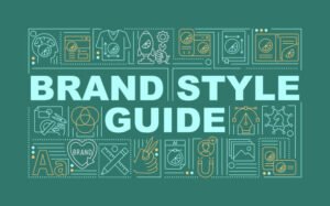
Using templates can help you understand how professional designs are structured. Look for a brand style guide template or various design ideas for graphic designers online. As you adapt these templates to your needs, take note of how each element is arranged and how the overall layout is balanced.
Consider these steps:
- Select a template that closely aligns with your project’s goals.
- Customize the template with your color palette, fonts, and images.
- Experiment by adjusting the layout to see how small changes can make a big difference.
Templates not only save time but also provide inspiration. They offer a starting point from which you can innovate and experiment. Over time, as you gain confidence and skill, you might find yourself modifying templates extensively—or even creating your own from scratch.
In addition, templates can help maintain consistency across multiple projects. By starting with a familiar layout, you can ensure that your designs have a unified look and feel.
This is particularly useful if you’re producing a series of related graphics or if you want to establish a recognizable visual style for your brand.
As you work with templates, always be willing to tweak and adjust. The goal is to learn from the structure provided by the template while gradually developing your own design instincts. With practice, you’ll begin to see how small adjustments lead to significant improvements in your overall design quality.
13. Incorporate Iconography
Icons are a powerful visual tool that can simplify complex ideas and add an extra layer of meaning to your design. They serve as visual shorthand that can communicate messages quickly and effectively.
For beginners, incorporating iconography can be a great way to enhance your design without needing extensive graphic design skills.
When selecting icons, aim for simplicity and consistency. Choose icons that align with your overall style and message. For instance, if you’re designing a website for a modern tech company, opt for sleek, minimalistic icons rather than ornate, detailed illustrations.
Practical suggestions include:
- Use icon libraries: There are numerous free and premium icon sets available online.
- Keep icons consistent: Ensure that the style, line thickness, and color scheme match throughout your design.
- Use icons to break up text: Icons can visually separate sections of content and make your design easier to scan.
Icons also add a touch of personality to your work. They can help emphasize key points, illustrate processes, or even serve as clickable elements in digital designs.
By integrating well-chosen icons, you provide a visual cue that complements your text and enhances the overall user experience.
Take time to experiment with different icon styles. Consider how various icons interact with your text and other design elements. As you become more comfortable, you can start to customize icons to better fit your brand’s personality. Whether you stick with standard icons or create your own, using iconography effectively can transform your design from ordinary to engaging.
14. Experiment with Shapes and Patterns
Shapes and patterns are versatile elements that can add visual intrigue to your design. Whether used as backgrounds, borders, or decorative accents, they can help organize content and guide the viewer’s eye. Experimenting with different shapes—geometric, organic, or abstract—can give your design a unique flair.
Start by exploring how different shapes can frame or highlight your content. For example, circular shapes can soften a design, while angular shapes might convey a sense of modernity or urgency. Patterns, on the other hand, can add texture and depth.
Use subtle patterns to create a background that doesn’t distract from your main content but still adds visual interest.
Here are some tips:
- Combine shapes strategically: Layer different shapes to create depth and interest.
- Use patterns sparingly: Ensure that any patterns used do not overpower the content.
- Experiment with transparency: Adjusting opacity can create interesting effects that enhance your design rather than clutter it.
The process of experimenting with shapes and patterns is one of exploration and creativity. As a beginner, allow yourself the freedom to try out different combinations without fear of “messing up” your design.
Often, unexpected pairings lead to innovative and striking visuals. Document your experiments so that you can build a personal library of design ideas to draw from in future projects.
As you explore, remember that the goal is to support the content—not to distract from it. Each shape or pattern should serve a purpose, whether it’s to frame an image, separate sections, or simply add a touch of style.
With time, you’ll develop a stronger sense of which shapes and patterns resonate best with your overall design aesthetic.
15. Leverage Negative Space in Your Layout
Negative space, or empty space, is an essential yet sometimes underutilized component of graphic design. When used effectively, it can transform a cluttered layout into one that feels open, airy, and balanced.
Negative space allows your design elements to “breathe” and draws attention to the areas that matter most.
Begin by assessing your current layouts. Are there areas where text or images feel squeezed? Introducing negative space in these areas can make your design look more organized. It’s not about leaving blank areas randomly—it’s a deliberate choice to emphasize the most important elements.
Key strategies include:
- Create visual breathing room by increasing margins and padding.
- Use negative space to separate sections of content, which improves readability.
- Experiment with layouts that intentionally incorporate large areas of empty space to draw focus to key messages.
Negative space is not wasted space—it’s an integral part of your design’s overall structure. It provides balance and helps define the relationships between various elements.
When you master negative space, you’ll find that your designs not only look more professional but also communicate your message more effectively.
Spend time refining your use of negative space by adjusting the layout of your elements. As you work through different designs, observe how the addition or removal of negative space alters the overall impact of your project.
With experience, you’ll develop an intuitive sense for when and how to use empty space to enhance your work.
16. Focus on Consistency Across Designs
Consistency is key to building a strong brand identity. Whether you’re creating multiple social media posts, website pages, or printed materials, maintaining a consistent design language helps your audience recognize and trust your brand. Consistency involves using the same color palettes, fonts, and design elements across all your projects.
Begin by developing a set of brand guidelines or a style guide that outlines your visual identity. This guide should include details on your color choices, typography, iconography, and layout structures.
Refer back to these guidelines whenever you work on a new project. Consistency not only reinforces your brand but also makes your design process more efficient by providing a clear framework.
Consider these steps for ensuring consistency:
- Create reusable templates for recurring design projects.
- Use the same imagery style and color treatments in all your designs.
- Regularly review your work to ensure that every piece aligns with your established guidelines.
Maintaining consistency across designs builds credibility and trust. When your audience sees a uniform visual language, they are more likely to associate your brand with reliability and professionalism.
Over time, consistent designs become a visual shorthand for your brand, making it easier for customers to recognize you in a crowded market.
Invest in your design system, and don’t be afraid to update your style guide as your brand evolves. Consistency is an ongoing effort that requires regular review and adjustment.
With time, you’ll find that a consistent approach not only improves the look of your designs but also streamlines your creative process, allowing you to produce quality work more efficiently.
17. Utilize Online Design Tools
In today’s digital age, numerous online tools make graphic design accessible to everyone. These platforms offer intuitive interfaces and pre-designed templates that are perfect for beginners. Tools like Canva provide guides in graphic design and a vast library of assets to help you jumpstart your projects.
Online design tools are especially valuable for non-designers because they remove much of the complexity from the process. With features like drag-and-drop functionality, built-in grids, and instant previews, you can experiment with different layouts and styles without needing advanced technical skills.
These platforms also often offer tutorials, tips, and inspiration galleries to help you improve your design skills gradually.
Key benefits of using online design tools include:
- Ease of use: No extensive training is required; you can learn by doing.
- Cost-effectiveness: Many tools offer free versions or affordable subscription plans.
- Collaboration: Share your projects easily with team members or clients for feedback.
Experimenting with these tools can help you understand design principles in a practical, hands-on way. Over time, as you become more comfortable, you may choose to explore more advanced software.
However, the accessibility and versatility of online tools make them an excellent starting point for anyone interested in graphic design.
Don’t hesitate to explore different platforms until you find one that fits your workflow and style. The more you practice, the more intuitive your design decisions will become.
Over time, these tools will not only simplify your creative process but also open up new avenues for experimentation and innovation.
18. Keep Your Audience in Mind
Every design decision should start with your audience. Understanding who will view your design is key to creating content that resonates.
Consider the demographics, interests, and needs of your audience when choosing colors, fonts, images, and overall style. This tailored approach ensures that your designs not only look good but also communicate effectively.
Begin by conducting basic research on your target audience. Who are they? What appeals to them visually? Answering these questions can help shape the aesthetic and tone of your designs.
For example, if you’re targeting a younger audience, you might lean towards bold colors and modern fonts. If your audience is more traditional, a classic design might be more appropriate.
Some actionable steps include:
- Create audience personas that detail the characteristics and preferences of your viewers.
- Test different design options with a small focus group to gather feedback.
- Adjust your designs based on what resonates best with your audience.
Keeping your audience in mind means that every element—from imagery to layout—should serve the overall purpose of engaging and informing. Tailor your approach for each project, ensuring that the final product speaks directly to those you wish to reach.
As you gain more insight into your audience, you’ll become more adept at predicting what works and what doesn’t.
This understanding will inform your design decisions and help you create more effective visuals over time. With every project, use audience feedback as a learning tool to refine your approach further.
19. Use Grids to Organize Content
Grids are a designer’s best friend. They provide a structured framework that helps you organize content in a logical, visually appealing manner. Whether you’re designing a brochure, website, or social media graphic, grids ensure that every element is aligned and balanced.
Begin by setting up a basic grid layout before you start placing elements. A well-defined grid provides consistency across your design, making it easier to maintain alignment and spacing. This structure helps you decide where to position text, images, and other graphics so that the overall layout feels cohesive.
Consider these benefits of using grids:
- Improved alignment: Grids help ensure that every element is placed logically, reducing visual clutter.
- Consistency: A grid system promotes uniformity across multiple designs, which is especially important for brand consistency.
- Flexibility: Even within a grid, you can experiment with different arrangements and hierarchies.
As you work with grids, try adjusting the number of columns and rows to see what best suits your content. A flexible approach to grid design allows you to adapt to various project requirements while still maintaining a clean structure. Over time, you’ll learn to trust your grid and use it as the foundation for every design decision.
Using grids also aids in establishing a clear visual hierarchy. By organizing content systematically, you can guide the viewer’s eye through the design naturally, ensuring that key messages are highlighted. This systematic approach not only improves aesthetics but also enhances the overall user experience.
20. Keep It Mobile-Friendly
In today’s digital landscape, it’s essential to design with mobile users in mind. More and more people access content via smartphones and tablets, so your designs need to be responsive and adaptable to different screen sizes.
Mobile-friendly design isn’t just about scaling down; it’s about rethinking your layout to ensure clarity and usability on smaller devices.
Begin by testing your designs on various screen sizes to see how they perform. A layout that looks great on a desktop may become cluttered or hard to navigate on a mobile device. Adjust font sizes, images, and spacing accordingly.
Prioritize readability and ease of interaction, ensuring that buttons and links are easily clickable on touchscreens.
Key strategies include:
- Use responsive design techniques: Ensure that your layout adjusts dynamically to different screen resolutions.
- Simplify navigation: Reduce the number of elements on the screen to prevent overwhelming mobile users.
- Test rigorously: Regularly check your designs on multiple devices to identify and fix any usability issues.
Mobile-friendly design is critical for reaching a broader audience. As more people use their phones to browse, a design that works well on mobile can significantly enhance user engagement and retention.
Incorporate mobile testing into your design process, and be willing to make adjustments until your design performs flawlessly on all devices.
21. Don’t Be Afraid to Experiment
Creativity thrives on experimentation. While it’s important to learn and follow design principles, don’t be afraid to push the boundaries and try new things. Experimentation is where innovation happens, and even if a particular idea doesn’t work out, you’ll learn valuable lessons that improve your future projects.
Take small risks by experimenting with new color combinations, unusual layouts, or different typography styles.
Sometimes breaking the rules can lead to unexpected and inspiring results. Document your experiments, noting what worked and what didn’t. This trial-and-error process is a fundamental part of growth as a designer.
Here are a few ideas to get started:
- Create multiple variations of a single design and compare their effectiveness.
- Use design challenges or prompts to push your creativity.
- Collaborate with others to gain fresh perspectives on your work.
Embrace failure as part of the learning process. Not every experiment will result in a masterpiece, but each attempt teaches you something new about design and your personal style. Over time, this willingness to experiment will help you develop a more refined and unique design approach.
22. Keep Learning and Improving
Graphic design is a dynamic field that is constantly evolving. Trends, technologies, and user preferences change, and it’s essential to stay updated. Dedicate time to continuous learning—whether through online courses, blogs, webinars, or local design meetups.
As you explore what is graphic designing and design ideas for graphic designers, you’ll build a stronger foundation for your skills.
Learning should be an ongoing process. Regularly challenge yourself to try new techniques, software, or creative processes. Follow design communities online and engage with peers to gain fresh insights and feedback. The more you learn, the more confident you’ll become in making informed design decisions.
Here are some ideas to fuel your continuous improvement:
- Set aside time each week to study design trends and tutorials.
- Participate in design challenges to push your creative boundaries.
- Reflect on your past projects and identify areas for improvement.
By consistently striving to improve, you not only enhance your skills but also stay inspired. Your journey as a designer is an evolving one—every project offers a new opportunity to learn, experiment, and refine your approach.
23. Use Feedback to Refine Your Work
Constructive feedback is an invaluable asset in your design journey. Whether it comes from peers, mentors, or your target audience, feedback can highlight aspects of your work that you may have overlooked. Embrace feedback as an opportunity to learn and grow, rather than taking criticism personally.
Start by sharing your designs with a small group of trusted individuals. Ask specific questions about clarity, layout, color choices, and overall impact. Use the feedback to make adjustments that enhance your work. Remember, even seasoned graphic designers continuously seek input to improve their craft.
Key practices include:
- Create a structured feedback process: Ask clear, targeted questions about your design.
- Be open-minded: Listen carefully and consider each suggestion before making changes.
- Iterate based on feedback: Refine your design incrementally until it meets your goals.
Over time, you’ll develop a thicker skin and a more discerning eye for design improvements. Regularly incorporating feedback will not only enhance the quality of your work but also help you better understand the needs of your audience. This iterative process is key to creating designs that are both visually appealing and effective.
24. Understand the Role of Typography in Branding
Typography isn’t just about choosing a font—it’s a critical component of your brand identity. The fonts you select help communicate the personality and values of your brand.
Whether you’re using serif fonts to evoke tradition or sans-serif fonts for a modern look, your typography choices play a major role in how your message is perceived.
Begin by exploring different font families and their characteristics. Experiment with various combinations to see which pairings best reflect your brand’s tone. Consider factors like readability, size, spacing, and weight.
The way your text is arranged can influence everything from the clarity of your message to the overall mood of your design.
Practical tips include:
- Create a typography hierarchy: Clearly distinguish headings, subheadings, and body text.
- Use contrasting fonts: Pair a decorative font for headings with a clean, simple font for body text.
- Adjust spacing: Fine-tune letter and line spacing to ensure that your text is both aesthetically pleasing and easy to read.
As you refine your typography, consider how it fits into the broader context of your design. Every choice—from font style to color—contributes to a cohesive brand image. Take time to study the typography used by brands you admire, and practice by redesigning sample layouts until you find a combination that resonates with your vision.
25. Have Fun with Your Designs
Perhaps the most important tip is to have fun. Graphic design is an art, and the creative process should be enjoyable. Allow yourself to experiment, make mistakes, and explore different styles. Creativity flourishes when you’re relaxed and open-minded, so embrace the journey of learning and self-expression.
Consider these suggestions:
- Keep a folder of inspiring designs: Look for work that excites you and analyze what makes it stand out.
- Set aside time for creative exploration: Dedicate sessions where the goal is to experiment rather than create a perfect design.
- Celebrate progress: Recognize your improvements, no matter how small, and use them as motivation to continue growing.
Having fun with your designs is not only rewarding on a personal level—it also leads to more innovative work. When you enjoy what you do, your passion shines through in your projects. This authenticity resonates with audiences and helps create a memorable brand image.
Conclusion
Graphic design is an ever-evolving field that offers endless opportunities for creativity and expression—even for non-designers and beginners. By mastering the basics, keeping your work simple, and continuously experimenting and learning, you can create designs that are both beautiful and effective.
Remember, every design project is a chance to refine your skills, and every mistake is a lesson. With these 25 graphic design tips in hand, you’re well on your way to producing cool graphics and communicating your message clearly. For more insights and expert advice on graphic design and branding, visit the MOVA Consulting website.